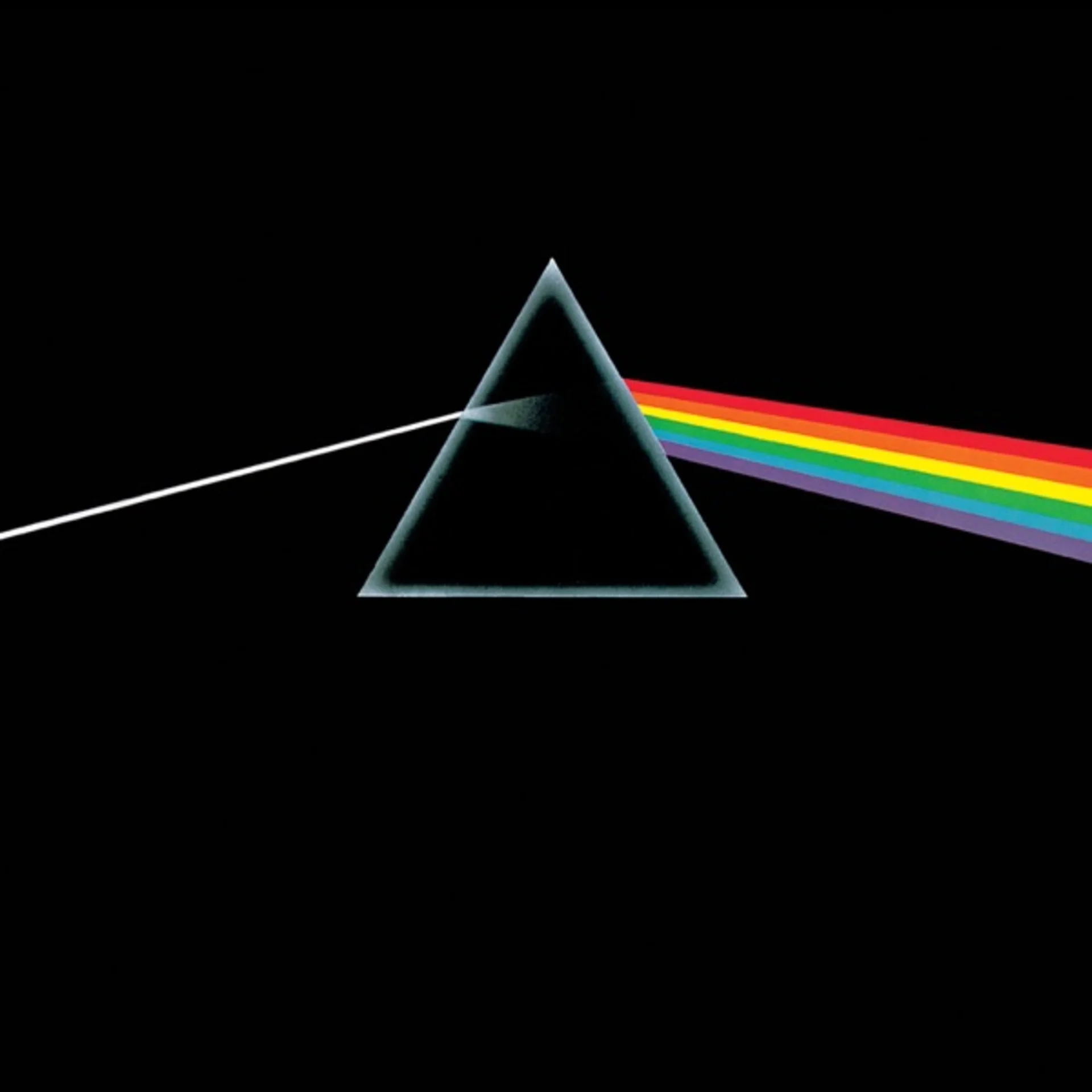
When Pink Floyd asked Storm Thorgerson of Hipgnosis to design the cover for their 1973 album, the brief was disarmingly open: create something simple, dramatic, and bold. Thorgerson and his partner Aubrey Powell had grown weary of the elaborate photo-composite covers they had been producing and saw an opportunity to go in the opposite direction. The band had recently incorporated a lighting rig that projected white light through a prism during live performances, and keyboardist Richard Wright suggested the prism concept. George Hardie, a young illustrator and associate of Hipgnosis, rendered the final artwork as a precise technical drawing rather than a photograph, giving the image its clean, almost clinical authority.
The design was radical for its time. In an era when progressive rock albums competed for the most elaborate gatefold fantasies, Thorgerson stripped everything to its essence: a single triangular prism refracting a beam of white light into a continuous spectrum against an unbroken black field. There is no band name, no album title, no record label logo anywhere on the front cover. EMI reportedly pushed back against this commercial gamble, but the band held firm. The prism sits slightly left of center, grounded by an invisible geometry that gives the image a sense of both stillness and motion as the light bends through glass.
Hardie drew the spectrum using an airbrush technique that produced bands of color so smooth they appear luminous, as though the cover itself emits light. The rainbow exits the prism and continues in a straight diagonal across the right side of the sleeve, passing off the edge and reappearing on the back cover, where it enters a second inverted prism and reconverges into white light. This wraparound continuity was a deliberate reference to the album's seamless musical transitions, where tracks bleed into one another without pause. The back cover also features a heartbeat line, an EKG trace that echoes the pulse heard in the opening track.
The black background is not merely empty space. It functions as a void, an infinite darkness that swallows everything except the light itself. Against this absence, the prism becomes a kind of philosophical instrument, splitting unified experience into its constituent emotional wavelengths. The triangle carries layered associations: the Greek delta symbol for change, the alchemical sign for fire, the Pythagorean geometry of stability. Thorgerson later acknowledged that he did not consciously intend all of these readings, but welcomed them as evidence that simple images accumulate meaning over time.
The color spectrum itself deserves close attention. Rather than the seven traditional Newtonian bands, Hardie rendered a continuous gradient that bleeds from deep violet through indigo, blue, green, yellow, and orange into red. The transition is seamless, without hard edges between hues, suggesting that emotional states flow into one another rather than existing in discrete categories. The warm colors, red and orange, occupy the bottom of the spectrum, closest to the viewer, while the cooler tones recede upward, creating a subtle spatial depth within what initially reads as a flat graphic.
The typography choices reinforce the cover's commitment to absence. By refusing to print any text on the front, Thorgerson gambled that the image would become self-identifying, and he was right. Within months of release, the prism was as recognizable as any band logo in rock history. The interior gatefold featured stickers of two pyramids photographed at Giza, continuing the triangular motif, and the poster insert included photographs shot through colored filters, all reinforcing the album's meditation on light, perception, and the gap between what we see and what exists.
The cover's production process was itself meticulous. Hardie spent weeks refining the angle of refraction to ensure optical plausibility while maintaining graphic impact. The prism's proportions are not scientifically accurate, the refraction angle is exaggerated for visual drama, but the image reads as truthful because its internal logic is consistent. Every line is deliberate, every gradient calibrated, and the result is an image that functions simultaneously as physics diagram, fine art print, and commercial packaging.
What Thorgerson achieved was nothing less than a paradigm shift in album art. The cover proved that pure abstraction, with no reference to the musicians, their genre, or their era, could sell more than forty-five million copies. It influenced generations of designers to trust conceptual minimalism over photographic literalism. The prism has been tattooed on countless arms, silk-screened onto T-shirts, projected onto buildings, and referenced in advertisements across every medium. Its enduring power lies in its refusal to date: because it depicts a universal physical phenomenon rather than a cultural artifact, it exists outside time, which is precisely the album's subject.
Get notified when we publish new cover stories. Download the Behind the Covers app and turn on notifications — a new album art deep dive, every day.
Loved the story behind The Dark Side of the Moon? Hear the album or add it to your collection.
More by Pink Floyd
More Rock Covers


More from the 1970s


Want to explore more?
Never miss a new cover story
Get the Behind the Covers app and turn on notifications — we publish new album art deep dives every day.