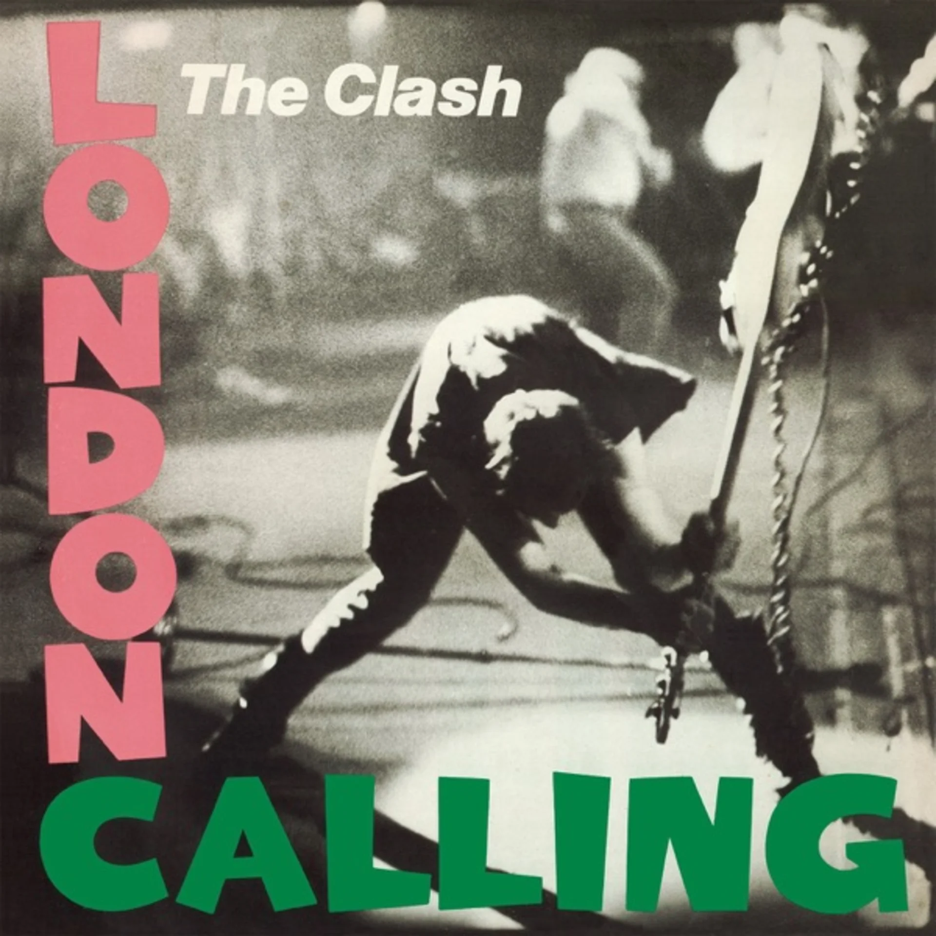
Pennie Smith did not want the photograph used. The rock photographer, who had been embedded with the Clash throughout their 1979 North American tour, considered the image too blurry, too poorly framed, too much of a technical failure to serve as an album cover. It showed bassist Paul Simonon in the act of smashing his Fender Precision Bass against the stage at the Palladium in New York City on September 21, 1979, captured at the exact moment of impact when the instrument's body was already splintering against the monitor. Smith thought the focus was too soft. The band and designer Ray Lowry thought it was the greatest rock photograph ever taken.
Smith shot the image from the photo pit below the stage, angling her camera upward to catch Simonon in a lunging, full-body swing. His legs are spread wide in a power stance, his arms extended overhead with the bass raised like an axe, and his body forms a dramatic diagonal that drives from the upper left to the lower right of the frame. The composition is dynamic to the point of violence, every line in the image, Simonon's body, the bass, the monitor's edge, converging toward the point of impact. It is a photograph of destruction caught in the fraction of a second before completion.
Lowry, a graphic designer and illustrator who had been traveling with the band as a kind of artist-in-residence, designed the sleeve to echo the typography of Elvis Presley's 1956 debut album. The pink and green lettering of "London Calling" and "The Clash" directly references the pink and green of "Elvis Presley" and "Rock n' Roll" on that earlier cover, a deliberate visual rhyme that positioned the Clash as heirs to rock and roll's original revolutionary energy. The font is bold, condensed, and slightly irregular, as though set in hot metal type by a compositor in a hurry.
The photograph's slight blur, the very quality that Smith objected to, is what gives it its kinetic power. A perfectly sharp image would freeze the moment into stillness; the soft focus preserves its motion, allowing the viewer's eye to track the trajectory of the swing. The grain of the high-speed film adds texture and urgency, placing the image in the tradition of photojournalism rather than studio portraiture. This is not a posed publicity shot but a document of real rage captured in real time by a photographer working on instinct.
The color palette of the sleeve is dominated by the photograph's natural tones: the dark stage, the white and black of Simonon's clothing, the warm amber of the stage lighting catching his face and arms. Lowry's typography overlays this in hot pink and acid green, two colors that vibrate against the image's muted documentary palette with almost aggressive cheerfulness. The contrast between the photograph's violence and the lettering's pop-art brightness creates a tonal dissonance that mirrors the album's own fusion of punk fury with reggae, jazz, and rockabilly warmth.
The layout places the photograph full-bleed across the entire front cover, with the text positioned to echo Elvis's original design: band name at top, album title at bottom, both offset slightly left. A thin black border frames the image on three sides, while the bottom edge bleeds off, as though the stage extends beyond the sleeve. This compositional choice makes the viewer feel positioned in the photo pit alongside Smith, looking up at the spectacle of destruction from below.
Simonon later explained that his frustration stemmed from a New York security team that was preventing the audience from standing up and dancing. "I didn't have a chance to really plan it," he said. "I just picked up the bass and went berserk." The spontaneity is visible in the photograph: this is not a calculated Pete Townshend windmill or a choreographed Hendrix guitar burn, but an eruption of genuine anger that happened to be caught by a photographer with extraordinary reflexes and an instinct for the decisive moment.
The cover has been voted the greatest album cover of all time in multiple polls, and its influence extends far beyond punk. It established the template for live-action album photography that privileges energy over technical perfection, for design that quotes and subverts earlier iconography, and for the idea that the most powerful images in rock music are the unplanned ones. Smith's reluctance to use the photograph, and the band's insistence on overruling her, produced an image whose slight imperfection is precisely what makes it feel true.
Get notified when we publish new cover stories. Download the Behind the Covers app and turn on notifications — a new album art deep dive, every day.
Loved the story behind London Calling? Hear the album or add it to your collection.
More Rock Covers

More from the 1970s
Want to explore more?
Never miss a new cover story
Get the Behind the Covers app and turn on notifications — we publish new album art deep dives every day.