The Low End Theory
A Tribe Called Quest · 1991
- Designer
- Zombart International
- Label
- Jive
- Decade
- 1990s
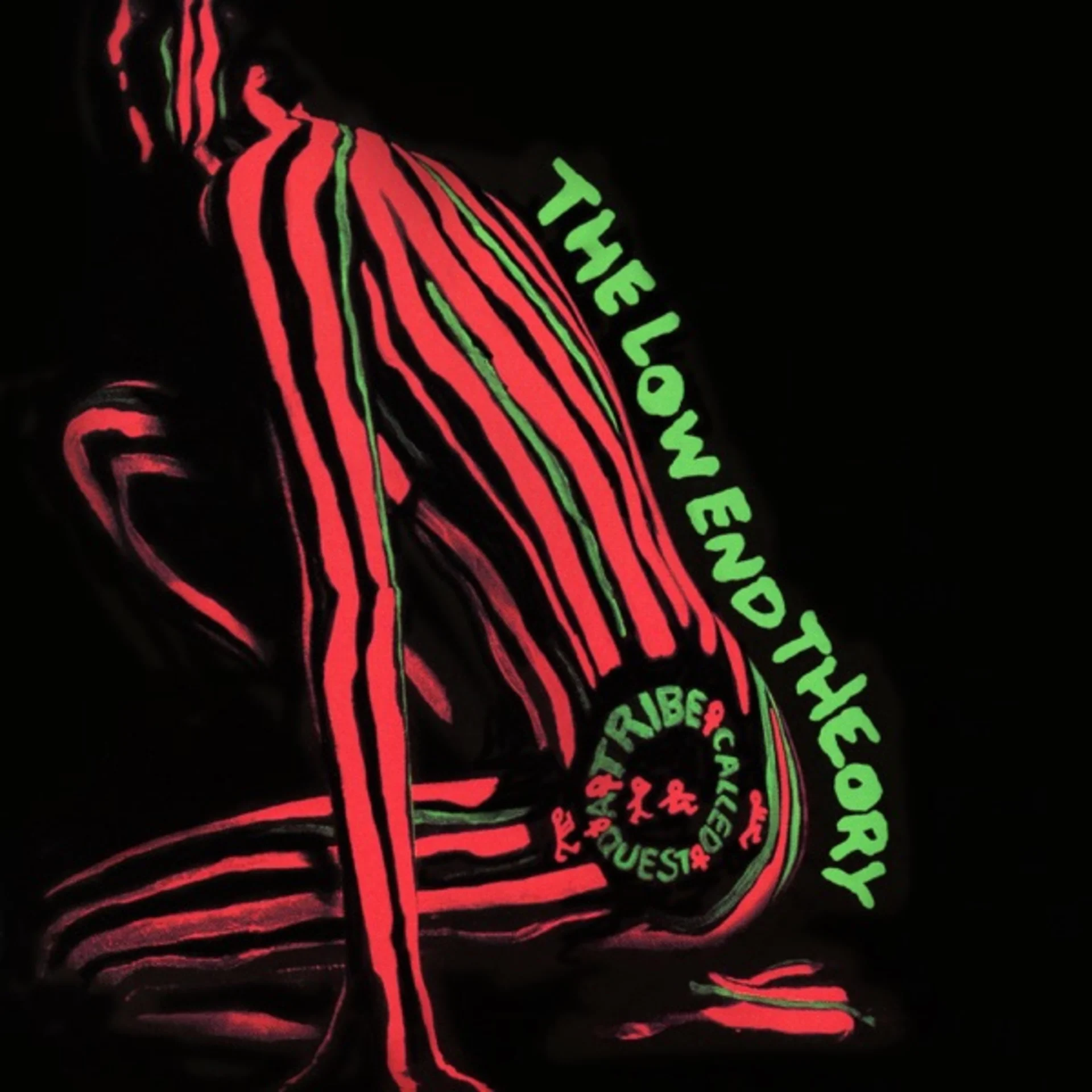
A Tribe Called Quest's second album arrived in 1991 with a cover that was as stripped-down and confident as the jazz-rap minimalism within. The design features a woman's figure photographed from behind, her back and lower body forming a sculptural silhouette against a black background. The image is tightly cropped and warmly lit, reducing the human form to an abstract composition of curves and shadows that communicates the album's aesthetic philosophy: that less is more, that space is as important as sound, and that the body and the beat are ultimately the same thing.
The low-end of the title refers to bass frequencies, the foundation of hip-hop production, and the cover's composition translates this sonic concept into visual terms. The figure's mass is concentrated in the lower portion of the image, with the curves of the body creating a visual weight that anchors the composition just as a bass line anchors a track. The upper portion of the frame is relatively empty, black space that gives the figure room to breathe and creates a visual ratio of presence to absence that mirrors the album's spacious production.
The photograph uses warm, golden lighting that gives the skin a luminous quality, transforming the human body from a sexual object into a sculptural one. The lighting is precise enough to define the contours of the figure without being so harsh as to create unflattering shadows or clinical detail. The result is an image that celebrates the body's form with the same sophisticated appreciation that the album brings to its jazz samples, finding beauty in curves, warmth, and the interplay of light and shadow.
The color palette is built from a narrow range of warm tones: the golden amber of lit skin, the deep brown of shadow, and the pure black of the background. This restricted palette creates an image of elegant simplicity that refuses the visual noise of competing colors. The warmth of the skin tones against the cool black background creates a figure-ground relationship that is as clean and satisfying as the album's production, where individual elements, a bass line, a snare hit, a jazz sample, are given space to exist in their own frequency range.
The composition's provocative element, a woman's body photographed from behind, has been read both as objectification and as celebration, and the ambiguity is likely intentional. Q-Tip and the group's art direction throughout their career balanced the sensual with the intellectual, refusing to choose between body and mind. The cropping of the image, which eliminates the head and feet to focus on the torso and hips, can be read as dehumanizing reduction or as formal abstraction, depending on the viewer's disposition and context.
The typography uses a clean, bold sans-serif font for the group name and album title, rendered in cream or white against the black background. The text is positioned at the top and bottom of the sleeve, framing the central image with geometric precision. The font choice is modern and confident, reflecting the group's self-assured artistic identity, and its clean lines create a visual counterpoint to the organic curves of the figure.
The back cover and packaging maintain the minimalist aesthetic with clean layouts, warm tones, and generous negative space. The overall design communicates a sophistication and self-assurance that was unusual in hip-hop packaging at the time, when visual excess was often equated with artistic ambition. Tribe's visual restraint argued that confidence could be quiet, that coolness was a matter of what you chose not to show.
The Low End Theory's cover established a visual template for jazz-influenced hip-hop that persists to this day: warm tones, minimal elements, sophisticated composition, and an aesthetic that draws from fine art photography rather than street culture. Its minimalism was as influential as its music, proving that a hip-hop album cover could communicate intelligence and taste through restraint rather than abundance, and that the most effective visual statement is sometimes the quietest one.
Get notified when we publish new cover stories. Download the Behind the Covers app and turn on notifications — a new album art deep dive, every day.
Loved the story behind The Low End Theory? Hear the album or add it to your collection.
More by A Tribe Called Quest
More Hip-Hop Covers


More from the 1990s


Want to explore more?
Never miss a new cover story
Get the Behind the Covers app and turn on notifications — we publish new album art deep dives every day.