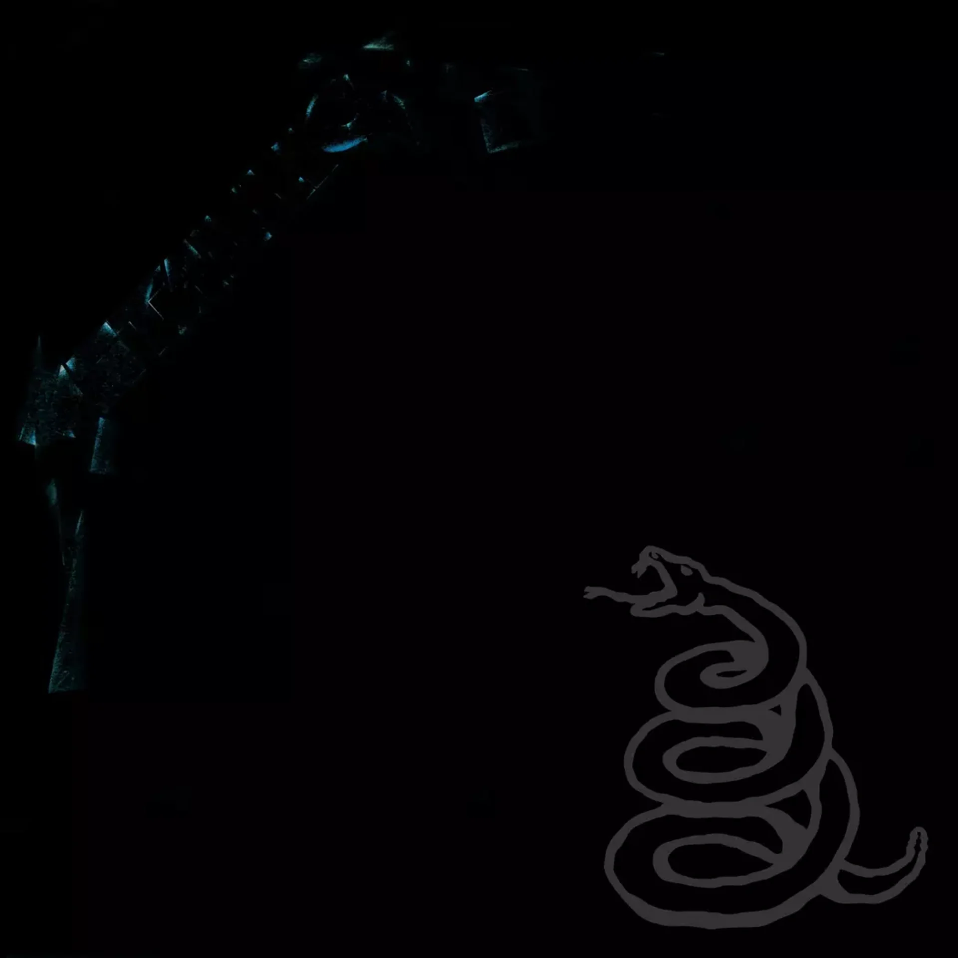
The most commercially successful heavy metal album in history arrived in a sleeve of almost total darkness. Metallica's 1991 self-titled release, universally known as the Black Album, presented a cover so minimal it made Unknown Pleasures look busy: a matte black field with the band's logo barely visible in slightly glossier black at the top, and a coiled snake rendered in dark grey at the center. The effect was less album cover than void, a visual black hole that absorbed light and expectation in equal measure.
The snake image was created by photographer and illustrator Don Brautigam, who rendered the coiled serpent with a photorealistic precision that gives it a tactile, almost sculptural presence despite the near-invisibility of the monochromatic palette. The snake is viewed from above, its body wound in a tight spiral that reads simultaneously as a compressed spring about to release and a zen circle of self-contained energy. The scales are rendered with meticulous detail that reveals itself only under direct light, when the grey tones differentiate from the black background enough to show the texture of individual plates.
Producer Bob Rock and the band worked with designer Peter Corriston on the overall packaging concept. The decision to go almost entirely black was a statement of commercial confidence bordering on arrogance: at a time when metal albums competed for shelf attention with vivid colors and elaborate illustrations, Metallica bet that their name alone would sell the record. They were right. The album has sold over sixteen million copies in the United States alone, its visual austerity functioning as a marker of seriousness in a genre often dismissed as juvenile.
The Metallica logo at the top of the sleeve is printed in a gloss varnish on matte stock, creating a difference in surface sheen rather than color. In normal lighting conditions, the logo is nearly invisible; it emerges only when light catches the gloss at the right angle, materializing and disappearing as the viewer shifts the sleeve in their hands. This interactive quality, the logo hiding in plain sight, gives the physical object a presence that digital thumbnails cannot capture and anticipates the premium packaging strategies of later decades.
The snake occupies the lower center of the composition, its coiled body creating a roughly circular form that contrasts with the rectangular geometry of the sleeve. The placement leaves vast expanses of empty black above and around the snake, creating a spatial relationship in which the small, dense figure is surrounded and almost overwhelmed by darkness. This sense of isolation within immensity mirrors the album's musical shift from the complex, thrash-metal architectures of earlier records to a more stripped-down, emotionally direct sound that privileged impact over intricacy.
The coiled serpent carries dense symbolic weight across multiple traditions. In Metallica's context, the snake suggests danger held in reserve, venom stored but not yet deployed, aggression controlled by discipline. The tight coil also evokes the Ouroboros, the ancient symbol of cyclical renewal, and the medical caduceus, linking destruction to healing. These associations were likely not all intentional, but the image's power lies in its capacity to generate readings without confirming any of them.
The back cover maintains the black-on-black palette with the track listing printed in a small, clean sans-serif font that requires effort to read, continuing the design's principle of withholding rather than displaying. The inner booklet provides the first color in the package, with lyrics and credits printed in a warm grey that barely registers against the black stock. The entire packaging experience is one of gradual revelation, of eyes adjusting to darkness and finding detail that was always there but initially invisible.
The Black Album's cover established a template for heavy rock packaging that valued restraint over spectacle, proving that in a visual marketplace crowded with skulls, flames, and demonic imagery, the most powerful statement a metal band could make was silence. Its influence extends through every black-sleeved album that followed, from AC/DC's Back in Black revival aesthetic to the matte-finish minimalism of contemporary post-metal. The design's enduring lesson is that darkness, when committed to fully, can be more dramatic than any amount of color.
Get notified when we publish new cover stories. Download the Behind the Covers app and turn on notifications — a new album art deep dive, every day.
Loved the story behind Metallica? Hear the album or add it to your collection.
More by Metallica


More Metal Covers


More from the 1990s


Want to explore more?
Never miss a new cover story
Get the Behind the Covers app and turn on notifications — we publish new album art deep dives every day.