
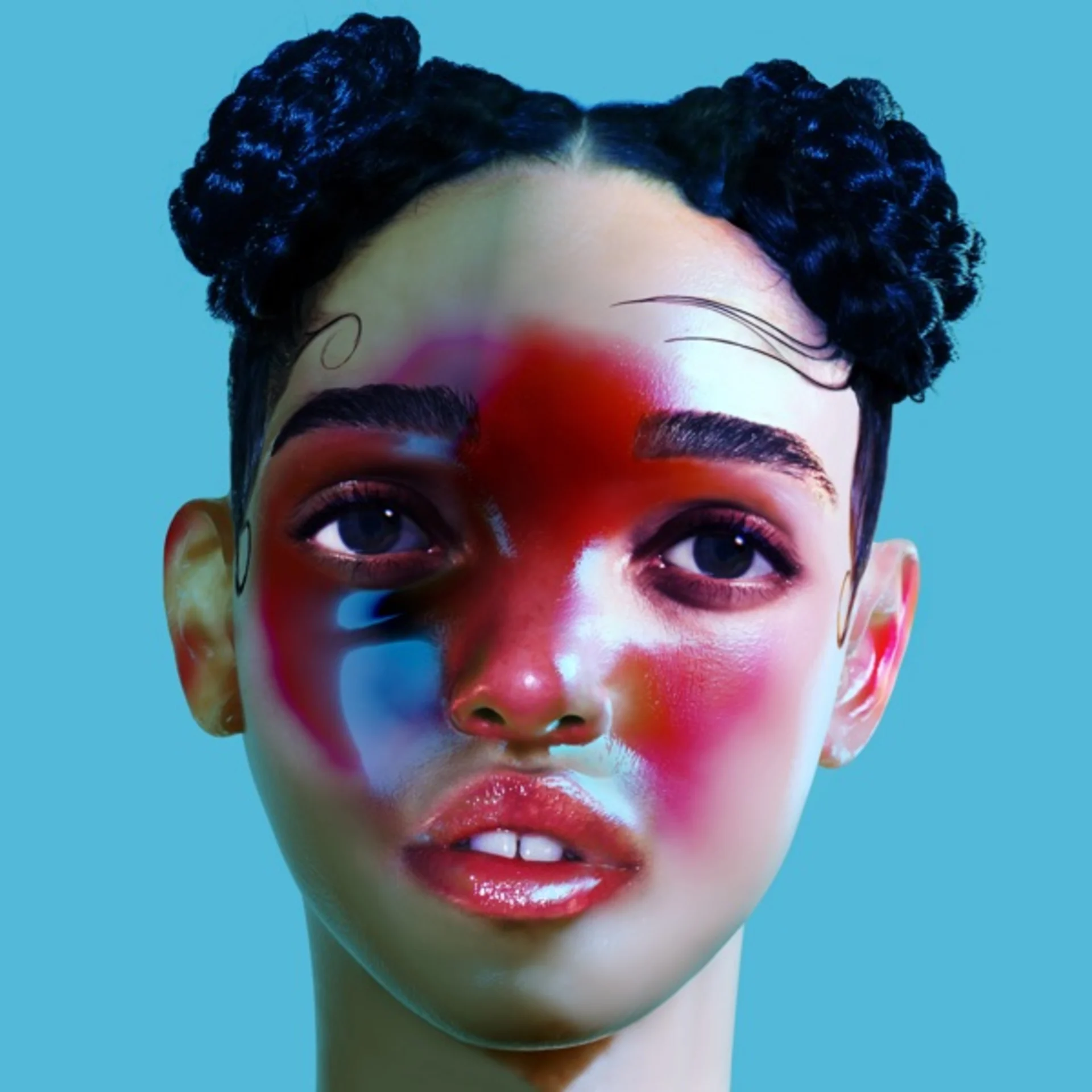
The cover of Portishead's 1994 debut presents a deliberately artificial portrait that evokes the glamour photography of 1960s European cinema while undermining its seductive power with an atmosphere of cold alienation. The image shows a woman, not vocalist Beth Gibbons but a model, styled in vintage fashion with heavy eye makeup, a sculpted hairstyle, and lighting that creates the dramatic shadows and luminous skin of a black-and-white film still. The photograph was art-directed by the band's Geoff Barrow and designed by the band's creative team to establish the visual tone of what would become the defining album of the trip-hop genre.
The model's styling is meticulously retro, evoking the ice-queen aesthetics of 1960s Vogue photography and the femmes fatales of French and Italian noir cinema. The hair is styled in a precise bouffant, the makeup emphasizes dark, dramatic eyes, and the lighting creates a chiaroscuro effect that sculpts the face with the same high-contrast technique used by studio photographers in Hollywood's Golden Age. Every element of the image is deliberately dated, creating a visual time capsule that matches the album's own strategy of sampling and recontextualizing vintage musical elements.
The composition is a close-up portrait, tightly framed to show the model's face and the upper portion of her shoulders. The background is dark and indistinct, eliminated by the dramatic lighting to create a void that focuses all attention on the face. The shallow depth of field blurs everything beyond the narrow plane of the features, creating a claustrophobic intimacy that mirrors the album's emotional intensity. The model's expression is studied and unreadable, simultaneously inviting and remote, beautiful and cold.
The color palette is nearly monochromatic, built from warm sepia tones that evoke the aged quality of vintage photographs. The warmth of the tones contradicts the image's emotional coolness, creating a visual tension between surface beauty and underlying alienation that mirrors the album's musical strategy of combining lush, cinematic production with lyrics of devastating emotional isolation. The warm sepia haze softens the image's edges and gives it a dreamy quality that the model's frozen expression constantly disrupts.
The lighting is the photograph's most expressive element. A strong key light from one side creates deep shadows that carve the face into geometric planes, while a softer fill prevents the shadows from going completely black. The result is a face that appears to be emerging from darkness, half-revealed and half-concealed, with the boundary between light and shadow bisecting the features in a way that suggests divided identity or hidden depths. This lighting technique is borrowed directly from film noir, where it served the same purpose of suggesting moral ambiguity and psychological complexity.
The typography uses a clean, serif font for the band name and album title, rendered in a cream or gold tone that complements the sepia palette. The text is positioned with generous spacing that gives the layout a gallery-like quality, treating the photograph as an art print rather than a commercial product. The word "Dummy" sits below the image with quiet irony, its implications of artificiality and ventriloquism resonating with a cover that is itself an exercise in deliberate construction and stylistic ventriloquism.
The packaging extends the vintage aesthetic with additional photographs and design elements that maintain the album's visual coherence. The booklet creates a world of old-Hollywood shadows and retro-futurist melancholy that the listener enters alongside the music, each medium reinforcing the other's atmosphere of beautiful desolation.
Dummy's cover established the visual identity of trip-hop as a genre that looked backward as much as it sounded forward, finding its aesthetic in the glamour and alienation of mid-century visual culture rather than in the futuristic imagery that electronic music typically adopted. The cover's influence extends through the visual design of 1990s electronic and alternative music, where retro styling and cinematic atmosphere became markers of sophistication and emotional depth.
Get notified when we publish new cover stories. Download the Behind the Covers app and turn on notifications — a new album art deep dive, every day.
Loved the story behind Dummy? Hear the album or add it to your collection.
More Electronic Covers

More from the 1990s


Want to explore more?
Never miss a new cover story
Get the Behind the Covers app and turn on notifications — we publish new album art deep dives every day.