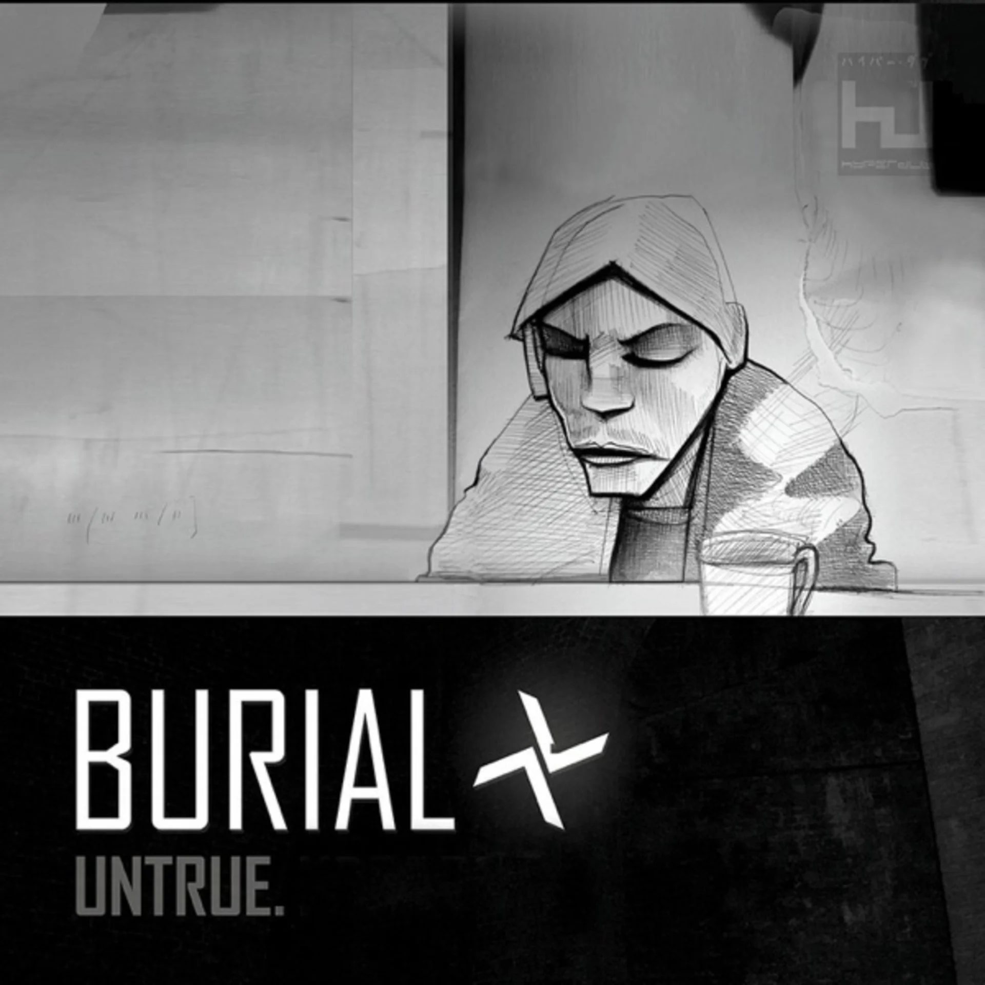
The cover of Burial's 2007 album is a photograph so degraded and atmospheric that it barely qualifies as an image at all. Through heavy grain, low resolution, and what appears to be rain or scratches on the lens, a hooded figure is just barely visible, their features completely obscured by shadow and the deliberate destruction of photographic information. The image has the quality of a surveillance camera still or a frame grabbed from deteriorating VHS footage, its visual poverty communicating the same emotional frequencies as the music within: loneliness, urban alienation, and the ghostly presence of human connection in spaces designed to prevent it.
The figure in the photograph appears to stand on an urban street or in a doorway, but the image is so degraded that the setting cannot be confirmed with certainty. The rain, whether real or an artifact of the image processing, adds a layer of visual noise that further obscures the already indistinct scene. The overall impression is of someone glimpsed through a rain-streaked window or a dirty bus shelter, a momentary human presence that the environment is actively working to erase.
The photograph's intentional degradation is its defining aesthetic strategy. The grain is so heavy that it breaks the image into a pointillist field of dark and light particles, each pixel struggling to cohere into recognizable form. The resolution is low enough that enlargement would reveal nothing but noise. The contrast is pushed until shadows become impenetrable black and highlights blow out to featureless white. Every technical decision moves the image further from clarity and closer to abstraction, creating a visual experience that parallels the music's own relationship to its source materials, which are sampled, chopped, and processed until the original recordings become ghostly, half-remembered presences.
The color palette is muted to the point of near-monochrome, built from cold greys, deep blacks, and the sickly amber of sodium streetlighting that gives the image its urban nighttime atmosphere. The warmth of the sodium light is the only relief from the image's overwhelming coldness, and it functions not as comfort but as a marker of specific place and time: late-night London, the hours between the last train and the first, when the city belongs to the sleepless and the solitary.
The composition, insofar as it can be discerned, places the hooded figure roughly at center, their body forming a vertical dark mass against a slightly lighter background. The hood conceals all facial features, making the figure anonymous and archetypal rather than individual. This anonymity connects the image to Burial's own practice of radical anonymity: for years after the album's release, the producer's identity remained a closely guarded secret, and the faceless figure on the cover served as a visual analogue for an artist who refused to participate in the economies of celebrity and self-promotion.
The typography uses a small, clean sans-serif font for the artist name and album title, rendered in white against the dark image. The text is positioned minimally, refusing to take up more space than necessary, and its clean geometry creates a stark contrast with the degraded, organic quality of the photograph. This contrast between typographic precision and photographic chaos mirrors the album's own tension between the meticulous arrangement of its soundscapes and the chaotic, disintegrating source materials from which they are built.
The physical packaging extends the cover's aesthetic of beautiful decay with additional dark, degraded imagery that maintains the album's visual tone of nocturnal urban solitude. The entire package feels like a document recovered from somewhere, slightly damaged by its passage through the world, carrying traces of the environment it has moved through.
Untrue's cover became the defining visual statement of dubstep's first wave, establishing an aesthetic of urban darkness, photographic degradation, and anonymity that influenced the visual identity of electronic music across multiple subgenres. The image proved that in an era of high-definition digital photography and elaborate Photoshop manipulation, the most evocative visual statement could be the most damaged one, and that sometimes the best way to depict a feeling is to show it disappearing.
Get notified when we publish new cover stories. Download the Behind the Covers app and turn on notifications — a new album art deep dive, every day.
Loved the story behind Untrue? Hear the album or add it to your collection.
More Electronic Covers

More from the 2000s
Want to explore more?
Never miss a new cover story
Get the Behind the Covers app and turn on notifications — we publish new album art deep dives every day.