Never Mind the Bollocks, Here's the Sex Pistols
Sex Pistols · 1977
- Designer
- Jamie Reid
- Label
- Virgin Records
- Decade
- 1970s
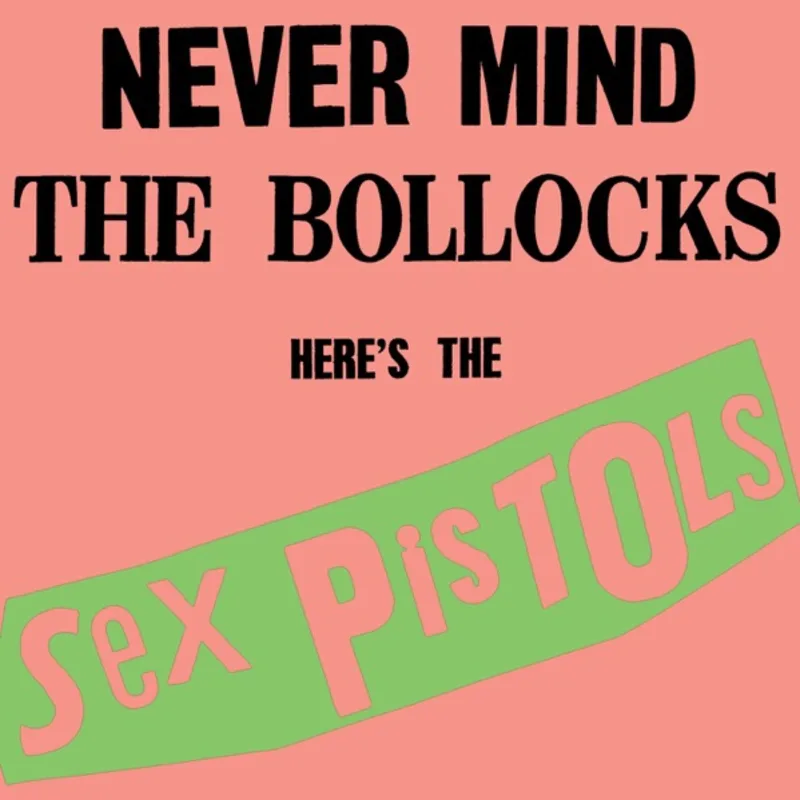
The most subversive album cover of 1977 was created with nothing more than scissors, glue, and letters ripped from newspaper headlines. Jamie Reid's design for Never Mind the Bollocks, Here's the Sex Pistols became punk rock's visual DNA, but it nearly landed record store owners in jail across Britain.
Reid conceived the cover as a deliberate assault on corporate rock aesthetics. Having met Malcolm McLaren through radical politics in the late 1960s, Reid brought his background in situationist art and anarchist graphics to the Sex Pistols' visual identity. The idea was simple: make it look like a ransom note demanding cultural hostages.
The execution was defiantly lo-fi. Reid physically cut individual letters from newspaper headlines and magazines, then pasted them onto paper to create the album title. Each letter was photographed separately and reassembled, creating the jagged, threatening typography that screamed from record store shelves.
Reid chose Day-Glo yellow as the background color specifically because it was cheap, garish, and associated with warning signs. The fluorescent pigment made the cover glow under shop lighting, ensuring it couldn't be ignored even from across a record store. Virgin Records initially balked at the aggressive design but ultimately embraced its provocative power.
The cover immediately triggered legal battles across Britain. The word "bollocks" led to obscenity prosecutions of record store owners in Nottingham and other cities. Virgin Records had to defend the album title in court, with linguistics professor James Kingsley testifying that "bollocks" was Old English for "small ball" and not inherently obscene.
Beyond the legal drama, Reid's design philosophy revolutionized music graphics. His cut-and-paste aesthetic became the template for countless punk and indie releases. The idea that anyone with scissors and newspapers could create powerful visual statements democratized album cover design.
The cover's influence extended far beyond music into fashion, advertising, and political graphics. Reid's ransom note typography appeared on everything from Vivienne Westwood's clothing designs to anti-establishment protest banners. The aesthetic became shorthand for rebellion itself.
Print production presented unique challenges. The fluorescent yellow required special inks that many pressing plants couldn't handle properly, leading to variations in color intensity across different manufacturing runs. Some early pressings featured colors so bright they seemed to vibrate off the vinyl sleeve.
Reid later revealed he intentionally made the design look "cheap and nasty" to mirror punk's rejection of progressive rock's elaborate packaging. While bands like Yes and Pink Floyd spent fortunes on gatefold artwork, the Sex Pistols' cover cost almost nothing to produce yet achieved greater visual impact.
The typography's crude construction was itself a political statement. In an era of computer typesetting and professional design studios, Reid's hand-cut letters declared that anyone could challenge corporate aesthetics with basic tools and fierce determination.
Decades later, the cover remains instantly recognizable and endlessly imitated. Reid's ransom note lettering spawned countless tributes, parodies, and homages across all media. The design proved that sometimes the most powerful graphics come not from expensive equipment but from scissors, glue, and revolutionary intent.
Loved the story behind Never Mind the Bollocks, Here's the Sex Pistols? Hear the album or add it to your collection.
More Punk Covers


More from the 1970s


Want to explore more?