
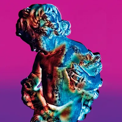
Stanley Donwood painted the cover for Kid A during a period of intense insomnia, working through the night in his studio while Thom Yorke and the band crafted their most radical sonic departure in nearby recording sessions. The haunting mountainous landscape emerged from Donwood's apocalyptic anxieties about the millennium bug and environmental collapse.
The concept grew organically from Donwood's collaboration with Yorke, who had been his friend since art school at the University of Exeter. Both men were consumed by millennial dread and the sense that technology was fundamentally reshaping human experience. Donwood wanted to create something that felt both ancient and futuristic, like a landscape from after the end of the world.
Donwood developed a unique technique using a light box, painting translucent layers that could be photographed and manipulated. He created multiple versions of mountainous forms, experimenting with different color treatments and layering effects. The process mirrored the band's approach to the album itself — traditional elements processed through technology into something unrecognizable.
Working in his cramped studio, Donwood used acrylic paints on acetate sheets, building up ghostly layers of color. He photographed each stage, creating a library of ethereal landscape fragments. The final image was assembled digitally, though it retained the organic quality of hand-painted work. The mountains seem to dissolve and reform, like memories of a place that might never have existed.
Donwood had been Radiohead's visual collaborator since The Bends, developing a visual language that evolved with their sound. His background in fine art and printmaking brought a sophisticated understanding of color and composition to rock album design. The Kid A sessions represented the deepest integration yet between his visual process and the band's musical experimentation.
The cover baffled many fans and critics upon release, just as the music did. Traditional rock press struggled to categorize both the sound and the artwork. Some dismissed it as pretentious, while others recognized it as a breakthrough in album art that matched the radical nature of the music. The lack of band photos or traditional rock imagery signaled Radiohead's complete rejection of their guitar-rock past.
The Kid A artwork became a touchstone for musicians seeking to visualize electronic and experimental music. Its influence can be seen in countless album covers that use similar techniques of layered transparency and environmental abstraction. Donwood's light box method inspired a generation of designers working at the intersection of analog and digital processes.
The cover spawned an entire series of related artworks, including the companion Amnesiac cover and exhibition pieces. Donwood and Yorke published limited edition prints and art books exploring the visual world they had created. The imagery became as integral to Radiohead's identity as their sound, proving that album art could still be a vital creative medium in the digital age.
The original paintings were created on pieces of acetate that Donwood could barely afford, working in a studio so small he could barely step back to view his work properly — a cramped creative process that somehow produced one of the most expansive and atmospheric album covers of the decade.
Loved the story behind Kid A? Hear the album or add it to your collection.
More by Radiohead

More Alternative Covers


More from the 2000s


Want to explore more?