The cover for Enter the Wu-Tang (36 Chambers) represents one of the most successful minimalist designs in hip-hop history, created under severe budget constraints that forced brilliant creative choices. What appears to be a calculated design decision was actually born from necessity — the group and their label had virtually no money for elaborate artwork.
The concept emerged from Wu-Tang Clan's obsession with martial arts films and Eastern philosophy, particularly the Shaw Brothers kung fu movies that heavily influenced their music and imagery. The group wanted their visual identity to reflect this aesthetic while maintaining the gritty, underground feel of their Staten Island origins.
The iconic 'W' logo was designed to evoke both the Wu-Tang sword from martial arts lore and a bat-like symbol that suggested mystery and power. The stark presentation against the yellow background created maximum impact with minimal elements, a philosophy that aligned perfectly with the group's DIY ethos.
The yellow background became a crucial element, chosen for its eye-catching properties on record store shelves and its association with cautionary signage — appropriate for an album that served as a warning shot to the hip-hop establishment. The color choice also referenced the yellow filters often used in martial arts films to create atmospheric tension.
The execution was notably crude by major label standards, with the logo appearing hand-drawn and imperfect. This roughness became a feature rather than a bug, communicating the raw authenticity that Wu-Tang Clan represented in contrast to the increasingly polished hip-hop productions of the early 1990s.
The back cover featured the group's now-famous chess piece imagery, with each member represented by different pieces, reinforcing themes of strategy and tactical thinking that permeated their music. The chess metaphor became central to their visual identity and philosophy.
Initial reactions from industry insiders were mixed, with some viewing the stark design as unprofessional compared to the elaborate artwork becoming standard for major hip-hop releases. However, the group and their management believed the simplicity would make the album instantly recognizable.
The cover's impact was immediate and lasting, helping establish the Wu-Tang 'W' as one of the most recognizable logos in music. The design's success proved that powerful branding didn't require expensive production values, just strong conceptual thinking.
The legacy of this cover extends far beyond hip-hop, influencing streetwear design, graphic design principles, and demonstrating how constraints can drive creativity. Countless artists have since adopted similar minimalist approaches, though few have achieved the same iconic status.
The design spawned an entire merchandising empire, with the Wu-Tang 'W' appearing on everything from clothing to jewelry, making it one of the most commercially successful album cover designs ever created. The logo's versatility and instant recognition factor made it perfect for brand extension.
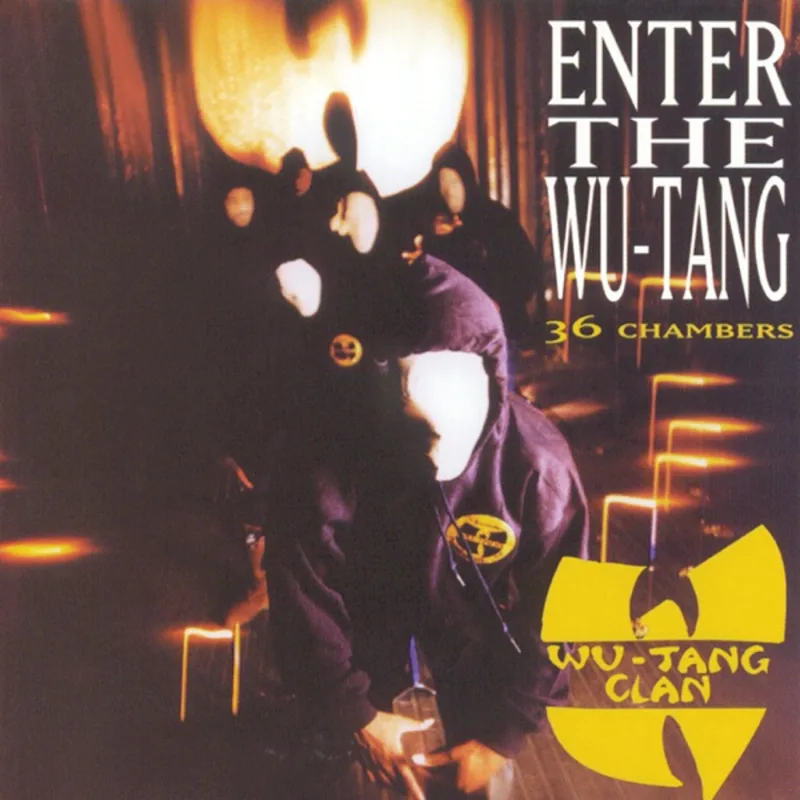
Perhaps most remarkably, the cover achieved its legendary status without ever featuring the artists themselves — a rarity in hip-hop where personality and image typically dominate visual presentation. This absence made the logo itself the star, creating a mystery that enhanced the group's mystique.
Loved the story behind Enter the Wu-Tang (36 Chambers)? Hear the album or add it to your collection.
More Hip-Hop Covers


More from the 1990s


Want to explore more?