Channel Orange
Frank Ocean · 2012
- Designer
- Frank Ocean
- Label
- Def Jam Recordings
- Decade
- 2010s
- Genre
- R&B
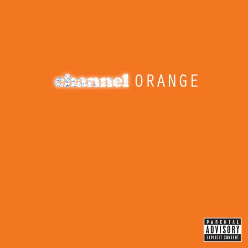
Frank Ocean made one of the boldest design decisions in modern R&B history when he chose to release Channel Orange with cover art that literally consisted of nothing but an orange rectangle. No photos, no typography, no artist name - just a solid field of carefully calibrated orange that would become one of the most recognizable album covers of the 2010s.
The concept emerged from Ocean's desire to create something that felt more like a found object than traditional album artwork. He wanted the cover to evoke the feeling of flipping through paint swatches or fabric samples, something tactile and everyday that would contrast sharply with the ornate, heavily stylized covers dominating hip-hop and R&B at the time.
Ocean worked closely with his team to achieve the perfect shade of orange - not too bright, not too muted, but something that would reproduce consistently across digital platforms and physical media. The color needed to work equally well as a tiny thumbnail on streaming services and as a full-sized vinyl gatefold.
The execution required meticulous attention to color reproduction and printing techniques. Ocean's team spent considerable time ensuring the orange would translate properly across different media formats, from the glossy finish of CDs to the matte texture of vinyl sleeves. They tested multiple orange variations before settling on the final hue.
Ocean served as his own art director for the project, making the final creative decisions about the cover's presentation. His choice to completely eliminate text from the front cover was particularly radical - even the most minimalist album covers typically include at least the artist's name or album title somewhere on the packaging.
The music industry's initial reaction was mixed, with some executives worried that the cover would be too abstract for retail environments. Record store employees reported confusion about how to file or display an album with no visible text, while streaming platforms had to rely entirely on metadata to identify the release.
Critics and design publications, however, immediately recognized the cover's bold simplicity. The design was praised for its confidence and its rejection of the maximalist tendencies that had dominated album artwork in the early 2010s. Ocean's willingness to let the music speak entirely for itself was seen as a statement of artistic confidence.
The cover's influence on subsequent R&B and hip-hop releases was immediate and profound. Artists like Solange, Tyler, the Creator, and Childish Gambino would later embrace similarly minimal approaches to their own album artwork, citing Channel Orange as a direct inspiration.
Channel Orange's cover helped establish a new aesthetic language for genre-fluid artists who wanted their visual presentation to feel as boundary-pushing as their music. The design became shorthand for artistic sophistication and creative independence within urban music.
The cover's digital-first approach also proved prescient, as streaming platforms began to dominate music consumption. The simple orange rectangle reproduced perfectly at any size and remained instantly recognizable even as a tiny playlist thumbnail.
Perhaps most remarkably, Ocean achieved maximum visual impact through complete subtraction - proving that in an oversaturated media landscape, sometimes the most radical choice is to show almost nothing at all.
Loved the story behind Channel Orange? Hear the album or add it to your collection.
More R&B Covers


More from the 2010s


Want to explore more?